

What is Regression
Regression analysis is a statistical technique used to investigate the relationships between variables. It allows us to understand how the value of one variable, known as the dependent variable, changes with respect to the values of one or more independent variables. Regression analysis is particularly useful in predicting the behavior of the dependent variable and identifying potential causal relationships between variables. It is widely employed across various fields, including finance, economics, social sciences, and engineering.
Regression analysis plays a significant role in the field of statistics for several reasons:
-
Predictive modeling
Regression analysis enables us to create models that can be used to make predictions about the dependent variable based on the values of the independent variables. This is particularly valuable for forecasting future trends or making data-driven decisions. -
Assessing relationships between variables
By quantifying the relationship between variables, regression analysis provides insights into the nature and strength of the association. This information can be useful for hypothesis testing and understanding potential causality. -
Identifying influential factors
Regression analysis helps in identifying which independent variables have the most significant impact on the dependent variable. This knowledge is crucial for developing effective interventions or strategies.
Conditional Mean
The conditional mean refers to the expected value of the dependent variable given the value(s) of the independent variable(s). In regression analysis, the conditional mean is represented by the fitted regression model, which quantifies the relationship between the dependent and independent variables. The conditional mean is used to make predictions about the dependent variable based on the independent variable(s).
For example, in a simple linear regression model, the conditional mean can be represented as:
where
Conditional Distribution
The conditional distribution refers to the distribution of the dependent variable given the value(s) of the independent variable(s). The conditional distribution provides information about the variability of the dependent variable around the conditional mean. It helps us understand the dispersion and shape of the dependent variable for each value of the independent variable(s).
In regression analysis, the conditional distribution is often assumed to follow a certain family of probability distributions. For example, in linear regression, it is commonly assumed that the conditional distribution of the dependent variable is normally distributed with a mean equal to the conditional mean and a constant variance (homoscedasticity).
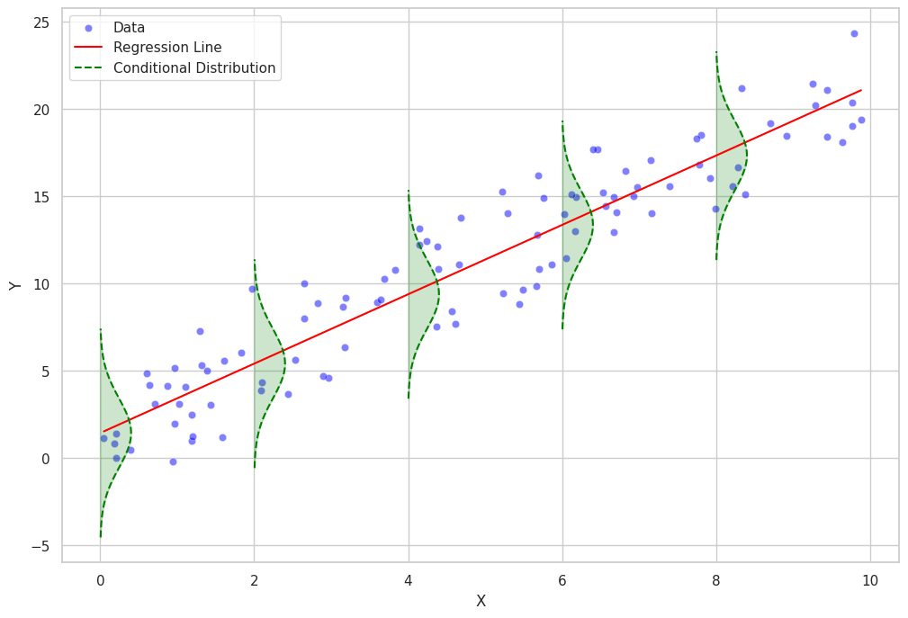
In more complex regression models, such as generalized linear models or nonparametric regression models, the conditional distribution can follow different families of probability distributions, such as Poisson, binomial, or gamma distributions.
Least Squares Method
The least squares method is a widely used approach in regression analysis for estimating the parameters of the regression model. It works by minimizing the sum of the squared differences between the observed values of the dependent variable and the values predicted by the model. The method ensures that the best-fitting line (in the case of linear regression) or curve (in the case of nonlinear regression) is obtained, which accurately represents the relationship between the variables.
Mathematical Formulation of Least Squares Method
The least squares method involves minimizing the sum of squared residuals, where the residual for each observation is the difference between the observed value of the dependent variable and the value predicted by the regression model.
In the case of a simple linear regression, the regression model can be represented as:
where
The objective of the least squares method is to find the values of
To minimize
Solving these equations simultaneously yields the estimates for
where
Regression Analysis Implementation
In this chapter, I will demonstrate how to implement a regression analysis using Python.
First, let's import the necessary libraries:
import numpy as np
import pandas as pd
import matplotlib.pyplot as plt
import seaborn as sns
from sklearn.linear_model import LinearRegression
Now, let's create some sample data for our linear regression analysis:
# Set a random seed for reproducibility
np.random.seed(42)

# Create the sample data
x = np.random.rand(50)
y = 2 * x + 1 + np.random.normal(0, 0.1, size=50)

# Store the data in a pandas DataFrame
data = pd.DataFrame({'X': x, 'Y': y})
Next, let's fit a linear regression model to our data:
# Fit a linear regression model
model = LinearRegression()
model.fit(data[['X']], data['Y'])

# Calculate the predicted values
data['Y_pred'] = model.predict(data[['X']])
Now, let's create a plot of the data points and regression line:
# Set the style and color palette for the plot
sns.set_style("whitegrid")
sns.set_palette("husl")

# Create a scatter plot of the data points
plt.scatter(data['X'], data['Y'], label='Data Points')

# Plot the regression line
plt.plot(data['X'], data['Y_pred'], color='r', label='Regression Line')

# Add labels and a legend
plt.xlabel("X")
plt.ylabel("Y")
plt.legend(loc='best')
plt.title("Data Points and Regression Line")

# Show the plot
plt.show()
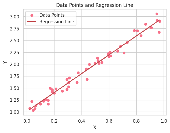
Now that we have visualized the data and the regression line, let's interpret the results of our linear regression analysis. The first thing to notice is the positive relationship between the X and Y variables, as the regression line has a positive slope. This indicates that as the X variable increases, the Y variable also increases.
In addition to visualizing the data and regression line, it's essential to interpret the estimated parameters (coefficients) of the linear regression model. The linear regression equation can be written as follows:
Here,
The
Let's retrieve the estimated parameters from our linear regression model and interpret them:
# Get the estimated parameters
intercept, slope = model.intercept_, model.coef_[0]

print(f"Intercept (β0): {intercept:.3f}")
print(f"Slope (β1): {slope:.3f}")
Intercept (β0): 1.010
Slope (β1): 1.978
In this example, the estimated intercept
Keep in mind that the true relationship between
Python Scripts for Plotting Conditional Distribution and Residual
Here are Python scripts for plotting conditional distribution and residual.
import numpy as np
import pandas as pd
import matplotlib.pyplot as plt
import seaborn as sns
from sklearn.linear_model import LinearRegression
from sklearn.metrics import mean_squared_error
from scipy.stats import norm

# Set seaborn style
sns.set(style="whitegrid")

# Generate a dataset
np.random.seed(0)
n = 100
x = np.random.uniform(0, 10, n)
y = 2 * x + 1 + np.random.normal(0, 2, n)
data = pd.DataFrame({"x": x, "y": y})

# Fit a linear regression model
model = LinearRegression()
model.fit(data[["x"]], data["y"])


# Add regression line to the dataset
data["y_pred"] = model.predict(data[["x"]])

rmse = np.sqrt(mean_squared_error(data["y"], data["y_pred"]))

def plot_conditional_distributions_filled(data, intervals, model):
    fig, ax = plt.subplots(figsize=(12, 8))

    # Scatter plot of the data points
    sns.scatterplot(data=data, x="x", y="y", color="blue", alpha=0.5, label="Data", ax=ax)

    # Regression line
    sns.lineplot(data=data, x="x", y="y_pred", color="red", label="Regression Line", ax=ax)


    for i in range(len(intervals) - 1):
        lower = intervals[i]
        upper = intervals[i + 1]
        mask = (data["x"] >= lower) & (data["x"] < upper)

        if mask.sum() > 0:
            subset = data[mask]
            mean = model.intercept_ + model.coef_[0] * lower
            std = rmse

            # Plot Gaussian curve
            x_vals = np.linspace(mean - 3 * std, mean + 3 * std, 100)
            y_vals = norm.pdf(x_vals, mean, std)
            y_vals = y_vals * (upper - lower) + lower

            ax.plot(y_vals, x_vals, color="green", linestyle="--", label="Conditional Distribution" if i == 0 else None)

            # Fill the Gaussian curve
            ax.fill_betweenx(x_vals, lower, y_vals, color="green", alpha=0.2)

    ax.set_xlabel("X")
    ax.set_ylabel("Y")
    ax.legend()
    plt.show()

# Define intervals for Gaussian curves
intervals = np.arange(0, 12, 2)

# Plot the conditional distributions with filled Gaussian curves
plot_conditional_distributions_filled(data, intervals, model)
import numpy as np
import pandas as pd
import matplotlib.pyplot as plt
import seaborn as sns
from sklearn.linear_model import LinearRegression
# Set a random seed for reproducibility
np.random.seed(42)
# Create the sample data
x = np.random.rand(50)
y = 2 * x + 1 + np.random.normal(0, 0.1, size=50)
# Store the data in a pandas DataFrame
data = pd.DataFrame({'X': x, 'Y': y})
# Fit a linear regression model
model = LinearRegression()
model.fit(data[['X']], data['Y'])
# Calculate the predicted values
data['Y_pred'] = model.predict(data[['X']])
# Set the style and color palette for the plot
sns.set_style("whitegrid")
sns.set_palette("husl")
plt.subplots(figsize=(12, 8))
# Create a scatter plot of the data points
plt.scatter(data['X'], data['Y'], label='Data Points')
# Plot the regression line
plt.plot(data['X'], data['Y_pred'], color='r', label='Regression', alpha=0.5)
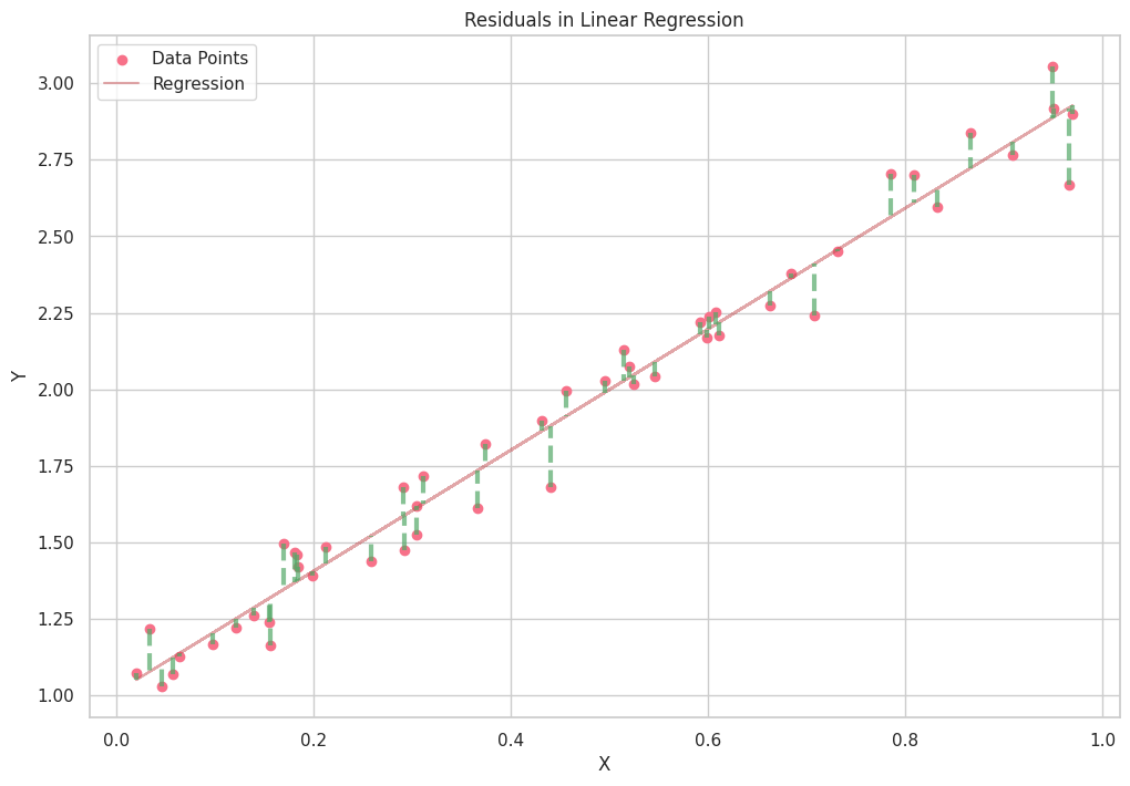
# Calculate and plot the residuals
for _, row in data.iterrows():
plt.plot([row['X'], row['X']], [row['Y'], row['Y_pred']], color='g', linewidth=3, linestyle='--', alpha=0.7)
# Add labels and a legend
plt.xlabel("X")
plt.ylabel("Y")
plt.legend(loc='best')
plt.title("Residuals in Linear Regression")
# Show the plot
plt.show()


Ryusei Kakujo


Weave the future of cities through data
Transportation modeling/ Urban planning/ Machine learning/ Computer science/ GIS