

Zスコアとは
Zスコア(標準化得点)とは、データの1つの値または観測値が、その分布の平均から何個の標準偏差離れているかを示す指標です。Zスコアは、異なるデータセットや分布間でデータを比較することを可能にする記述統計学の概念であり、データを標準化・正規化するのに役立ちます。
Zスコアを計算するための式は次のとおりです。
ここで、
Z X \mu \sigma
Zスコアの重要性と応用
Zスコアは、教育、金融、スポーツ、医療などのさまざまな分野で、データを理解し解釈する上で重要な役割を果たしています。Zスコアによってデータを標準化することで、異なる集団や測定値間でデータポイントを簡単に比較することができ、外れ値の特定、パフォーマンスの評価、および分布内での観測の相対的な位置を評価することができます。
Zスコアの一般的な応用には、次のようなものがあります。
- 異なる学校や教育システムの学生のテストスコアの比較
- 株式、債券、その他の金融商品のパフォーマンスの評価
- 異なるスポーツや競技のアスリートのパフォーマンスの評価
- 製造業や医療などの様々な業界での異常なイベントや発生の検出
Zスコアの計算方法
データポイントのZスコアを計算するには、次の手順を実行します。
- 分布の平均(
\mu - 分布の標準偏差(
\sigma - 個々のデータポイントから平均を引く(
X - \mu - ステップ3の結果を標準偏差(
\sigma
その結果得られた値が、データポイントのZスコアを表し、その値を使用して、データポイントの分布内での相対的な位置を決定し、他のデータポイントや分布と比較することができます。
Pythonを使ったZスコアの視覚化
この章では、Pythonを使ってZスコアを視覚化する方法を説明します。ランダムなデータセットを生成し、データポイントのZスコアを計算し、matplotlibとseabornを使用してデータをプロットし、データポイントの上位5%を強調表示します。
まず、numpyを使用してランダムなデータセットを作成し、データポイントのZスコアを計算する必要があります。
import numpy as np

# Generate a random dataset of 1000 normally distributed data points
np.random.seed(42)
data = np.random.normal(loc=50, scale=10, size=1000)

# Calculate mean and standard deviation
mean = np.mean(data)
std_dev = np.std(data)

# Calculate z-scores
z_scores = (data - mean) / std_dev

# Calculate the threshold for the top 5% (95th percentile)
threshold = np.percentile(z_scores, 95)
データポイントのZスコアを計算したら、matplotlibとseabornを使用してそれらを視覚化します。
import matplotlib.pyplot as plt
import seaborn as sns

# Set seaborn plot style
sns.set(style="whitegrid")

# Create a scatter plot of the data points
plt.figure(figsize=(12, 6))
plt.scatter(data, z_scores, c="blue", label="Data points")

# Highlight the top 5% of data points in red
top_5_percent = data[z_scores >= threshold]
top_5_percent_z_scores = z_scores[z_scores >= threshold]
plt.scatter(top_5_percent, top_5_percent_z_scores, c="red", label="Top 5%")

# Add labels and title
plt.xlabel("Data Points")
plt.ylabel("Z-Scores")
plt.title("Z-Scores Visualization")

# Add a horizontal line representing the threshold for the top 5%
plt.axhline(y=threshold, linestyle="--", color="black", label=f"Threshold (Top 5%): {threshold:.2f}")

# Add a legend
plt.legend()

# Show the plot
plt.show()
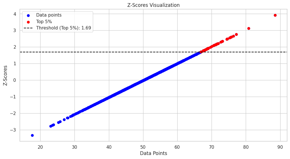
次のコードは、データポイントの散布図を生成し、それらの対応するZスコアをy軸に表示します。データポイントの上位5%は赤で強調表示され、上位5%のしきい値を表す水平破線がプロットに追加されます。
Zスコアを分布上で視覚化するには、ヒストグラムを作成し、確率密度関数(PDF)プロットを重ねます。
import matplotlib.pyplot as plt
import seaborn as sns
import numpy as np
import scipy.stats as stats

# Set seaborn plot style
sns.set(style="whitegrid")

# Create a histogram and PDF plot
plt.figure(figsize=(12, 6))
sns.histplot(data, kde=True, bins=30, color="blue", label="Histogram", alpha=0.6)
sns.kdeplot(data, color="black", linewidth=2, label="PDF")

# Calculate the data point corresponding to the 95th percentile threshold
threshold_data_point = mean + threshold * std_dev

# Add a vertical line representing the threshold for the top 5%
plt.axvline(x=threshold_data_point, linestyle="--", color="red", label=f"Threshold (Top 5%): {threshold_data_point:.2f}")

# Add labels and title
plt.xlabel("Data Points")
plt.ylabel("Density")
plt.title("Z-Scores Visualization on Distribution")

# Add a legend
plt.legend()

# Show the plot
plt.show()
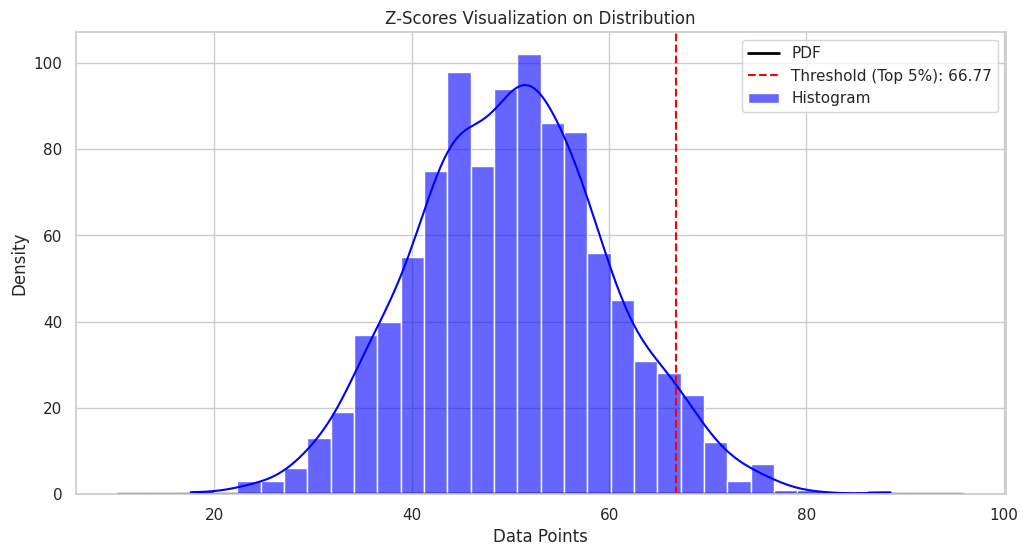
このプロットでは、データポイントの分布と、上位5%のデータポイントのZスコアのしきい値が表示されます。


Ryusei Kakujo


Weave the future of cities through data
Transportation modeling/ Urban planning/ Machine learning/ Computer science/ GIS