

What is Z-Score
A z-score, also known as a standard score, is a measure of how many standard deviations an individual data point or observation is from the mean of a distribution. It is a widely used concept in descriptive statistics that allows for the comparison of data points across different datasets or distributions. In essence, z-scores help to standardize and normalize data.
The formula for calculating a z-score is as follows:
where:
Z X \mu \sigma
Importance and Applications of Z-Score
Z-scores play a vital role in understanding and interpreting data in various fields, such as education, finance, sports, and healthcare. By standardizing data, z-scores allow for easy comparison of data points across different populations or measurements, making it possible to identify outliers, evaluate performance, and assess the relative standing of an observation within a distribution.
Some common applications of z-scores include:
- Comparing test scores of students from different schools or educational systems
- Evaluating the performance of stocks, bonds, or other financial instruments
- Assessing the performance of athletes in different sports or competitions
- Detecting unusual events or occurrences in various industries, such as manufacturing or healthcare
Calculating Z-Score
To calculate the z-score of a data point, follow these steps:
- Determine the mean (
\mu - Calculate the standard deviation (
\sigma - Subtract the mean from the individual data point (
X - \mu - Divide the result from step 3 by the standard deviation (
\sigma
The resulting value represents the z-score of the data point, which can be used to determine its relative standing within the distribution and compare it to other data points or distributions.
Visualizing Z-Scores with Python
In this chapter, I will demonstrate how to visualize z-scores using Python. We will generate a random dataset and calculate the z-scores of the data points. Then, we will plot the data and highlight the top 5% of the data points using matplotlib and seaborn.
First, we need to create a random dataset and calculate the z-scores of the data points. We will use numpy for these tasks.
import numpy as np

# Generate a random dataset of 1000 normally distributed data points
np.random.seed(42)
data = np.random.normal(loc=50, scale=10, size=1000)

# Calculate mean and standard deviation
mean = np.mean(data)
std_dev = np.std(data)

# Calculate z-scores
z_scores = (data - mean) / std_dev

# Calculate the threshold for the top 5% (95th percentile)
threshold = np.percentile(z_scores, 95)
Now that we have calculated the z-scores for the data points, we can visualize them using matplotlib and seaborn.
import matplotlib.pyplot as plt
import seaborn as sns

# Set seaborn plot style
sns.set(style="whitegrid")

# Create a scatter plot of the data points
plt.figure(figsize=(12, 6))
plt.scatter(data, z_scores, c="blue", label="Data points")

# Highlight the top 5% of data points in red
top_5_percent = data[z_scores >= threshold]
top_5_percent_z_scores = z_scores[z_scores >= threshold]
plt.scatter(top_5_percent, top_5_percent_z_scores, c="red", label="Top 5%")

# Add labels and title
plt.xlabel("Data Points")
plt.ylabel("Z-Scores")
plt.title("Z-Scores Visualization")

# Add a horizontal line representing the threshold for the top 5%
plt.axhline(y=threshold, linestyle="--", color="black", label=f"Threshold (Top 5%): {threshold:.2f}")

# Add a legend
plt.legend()

# Show the plot
plt.show()
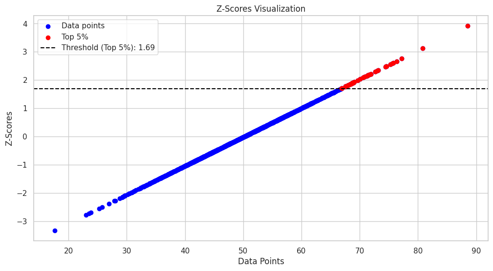
This code will generate a scatter plot of the data points, with their corresponding z-scores on the y-axis. The top 5% of the data points will be highlighted in red, and a horizontal dashed line representing the threshold for the top 5% will be added to the plot.
To visualize z-scores on a distribution, we will create a histogram and overlay a probability density function (PDF) plot.
import matplotlib.pyplot as plt
import seaborn as sns
import numpy as np
import scipy.stats as stats

# Set seaborn plot style
sns.set(style="whitegrid")

# Create a histogram and PDF plot
plt.figure(figsize=(12, 6))
sns.histplot(data, kde=True, bins=30, color="blue", label="Histogram", alpha=0.6)
sns.kdeplot(data, color="black", linewidth=2, label="PDF")

# Calculate the data point corresponding to the 95th percentile threshold
threshold_data_point = mean + threshold * std_dev

# Add a vertical line representing the threshold for the top 5%
plt.axvline(x=threshold_data_point, linestyle="--", color="red", label=f"Threshold (Top 5%): {threshold_data_point:.2f}")

# Add labels and title
plt.xlabel("Data Points")
plt.ylabel("Density")
plt.title("Z-Scores Visualization on Distribution")

# Add a legend
plt.legend()

# Show the plot
plt.show()
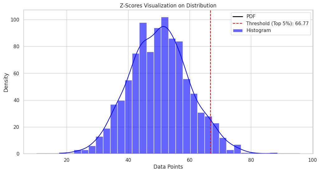
The resulting plot will show the distribution of the data points and the z-score threshold for the top 5% of the data points.


Ryusei Kakujo


Weave the future of cities through data
Transportation modeling/ Urban planning/ Machine learning/ Computer science/ GIS