

What is Responsive Design
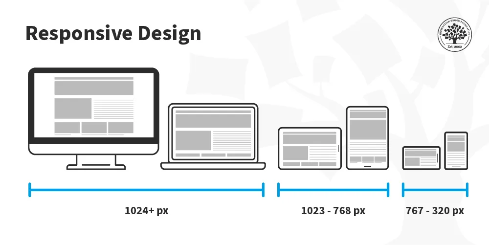
Responsive design is an approach to web design and development that aims to make websites and web applications adapt and render effectively on different devices and screen sizes. The main goal of responsive design is to provide an optimal viewing experience for users, regardless of the device they are using. This means that a responsive website should be easy to read and navigate with minimal resizing, panning, and scrolling.
Responsive design is important for several reasons:
-
Enhanced User Experience
It ensures that users have a good browsing experience regardless of the device they are using. This is especially important given the variety of devices people use to access the web, from smartphones to large desktop monitors. -
Improved SEO
Search engines, notably Google, prefer websites that are mobile-friendly. Having a responsive design can improve a site's search engine rankings, especially for searches performed on mobile devices.
Core Concepts
I will explain the four pillars of responsive design: fluid grids, flexible images, media queries and responsive typography.
Fluid Grids
Traditionally, websites were designed using fixed measurements, such as pixels. This approach led to the creation of designs that appeared consistent across similar screen sizes but became problematic when viewed on devices with different dimensions. Fluid grids emerged as a solution to this problem.
What are Fluid Grids
Fluid grids are a system that involves using relative units (like percentages) instead of absolute units (like pixels) for defining the width, height, and spacing of elements on a webpage. This enables the webpage layout to resize itself relative to the screen size.
Why Use Fluid Grids
Using fluid grids ensures that your website's layout will adjust automatically to different screen sizes. This flexibility is crucial in the current diverse landscape of devices, including desktops, laptops, tablets, and smartphones.
Implementing Fluid Grids
To implement a fluid grid, you must set the width of the elements in relative units. For example, if you want a column to take up 50% of the screen width regardless of the device, you would set the width to 50%. This can be done using CSS, as shown below:
.column {
    width: 50%;
}
Flexible Images
Another critical aspect of responsive design is handling images. As screens shrink or expand, it is important that images within the content adapt accordingly without causing layout issues.
What are Flexible Images
Flexible images are images that can scale and change their dimensions relative to their container. This prevents them from "spilling over" the container and breaking the layout, especially on smaller screens.
Why Use Flexible Images
Using flexible images ensures that your website remains aesthetically pleasing and functional across all devices. It also prevents issues such as cropping or distortion, which can occur if images do not adapt to different screen sizes.
Implementing Flexible Images
You can make images flexible by setting their maximum width to 100% of their containing element. This can be done using CSS, as shown below:
img {
    max-width: 100%;
}
Media Queries
Media queries are the third pillar of responsive design. They allow you to apply different styles and layouts depending on the characteristics of the device screen.
What are Media Queries
Media queries are a feature of CSS3 that allow content to adapt to different conditions such as screen resolution, device type, and orientation. They can be used to check many things, like width and height of the viewport, width and height of the device, screen resolution, etc.
Why Use Media Queries
Using media queries allows designers to create a tailored experience for different devices. For instance, a 3-column layout that looks great on a desktop might be too cluttered on a smartphone. With media queries, you can stack the columns vertically on smaller screens.
Implementing Media Queries
Media queries can be implemented by using the @media rule inside your CSS. Below is an example that changes the background color of a webpage when its width is less than 600 pixels:
@media screen and (max-width: 600px) {
    body {
        background-color: lightblue;
    }
}
Combining Media Queries with Fluid Grids and Flexible Images
When combined, media queries, fluid grids, and flexible images work together to create a truly responsive design. For example, you can use media queries to change the grid layout on different screens, and at the same time ensure that the images within those grids are flexible.
Here is an example that demonstrates how these concepts can be combined:
/* Define a two-column layout for large screens */
@media screen and (min-width: 900px) {
    .column {
        width: 50%;
    }
}

/* Stack columns vertically and adjust widths for smaller screens */
@media screen and (max-width: 899px) {
    .column {
        width: 100%;
    }
}

/* Ensure images are flexible */
img {
    max-width: 100%;
}
This CSS example shows how media queries are used to define different styles for large and small screens, while fluid grids ensure that the columns are proportionally resized, and flexible images adapt to the available space.
Responsive Typography
Apart from grids and images, typography is another important element that should adapt to different devices. The text should be legible and comfortable to read, regardless of the screen size.
What is Responsive Typography
Responsive typography involves adjusting the size, spacing, and layout of text based on the screen size and resolution.
Why Use Responsive Typography
Well-adjusted typography improves readability and ensures that the text doesn't appear too small on mobile devices or too large on desktop screens. This enhances the overall user experience.
Implementing Responsive Typography
You can use media queries to adjust font size, line height, and other typography properties based on the screen size. Here’s an example:
@media screen and (min-width: 900px) {
    body {
        font-size: 18px;
    }
}

/* Adjust font size for smaller screens */
@media screen and (max-width: 899px) {
    body {
        font-size: 16px;
    }
}


Ryusei Kakujo


Weave the future of cities through data
Transportation modeling/ Urban planning/ Machine learning/ Computer science/ GIS