

Introduction
Histograms are a visualization tool that allows us to understand the distribution of a dataset by visualizing the frequency or count of values within different intervals, known as bins. In this article, I will introduce how to plot histograms using Pandas.
Single Variable Histogram
First, we will need to import the necessary libraries and generate some data.
import pandas as pd
import matplotlib.pyplot as plt
import numpy as np

# Generating a DataFrame with 1000 random values
np.random.seed(0)  # To maintain consistency in generated values
df = pd.DataFrame({'Value':np.random.normal(10, 2, 1000)})
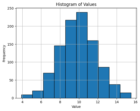
We have a DataFrame df with 1000 observations drawn from a normal distribution with a mean of 10 and a standard deviation of 2. Now, we'll plot a histogram using the hist() method:
df['Value'].hist(edgecolor='black')
plt.title('Histogram of Values')
plt.xlabel('Value')
plt.ylabel('Frequency')
plt.show()
Multiple Variable Histogram
For multiple variables, let's add another column to our DataFrame.
df['Value_2'] = np.random.normal(15, 3, 1000)
Here, we've created a new column Value_2 with 1000 observations drawn from a normal distribution with a mean of 15 and a standard deviation of 3. Let's plot histograms for both variables:
df[['Value', 'Value_2']].plot(kind='hist', rwidth=0.8, alpha=0.5, bins=30)
plt.title('Histogram of Values')
plt.xlabel('Value')
plt.ylabel('Frequency')
plt.show()
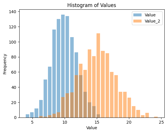
This code will generate overlaid histograms for Value and Value_2. The alpha parameter controls the transparency of the colors, making it possible to see overlapping areas.
Changing Bin Size
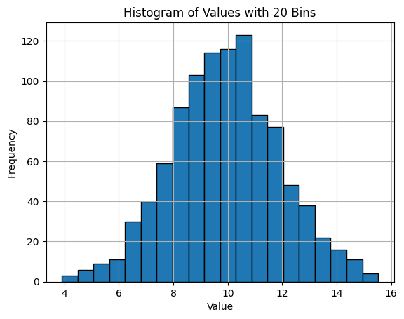
The bins argument in the hist() function determines the number of equally spaced bins in the range. Let's change the bin size to 20:
df['Value'].hist(bins=20, edgecolor='black')
plt.title('Histogram of Values with 20 Bins')
plt.xlabel('Value')
plt.ylabel('Frequency')
plt.show()
Adding Titles and Labels
Adding titles and labels is done using plt.title(), plt.xlabel(), and plt.ylabel(). We've already been using these functions above.
Changing Color and Style
You can change the color of the histogram using the color parameter, and also add a grid using plt.grid():
df['Value'].hist(bins=20, color='green', edgecolor='black')
plt.title('Green Histogram of Values with 20 Bins')
plt.xlabel('Value')
plt.ylabel('Frequency')
plt.grid(True)
plt.show()
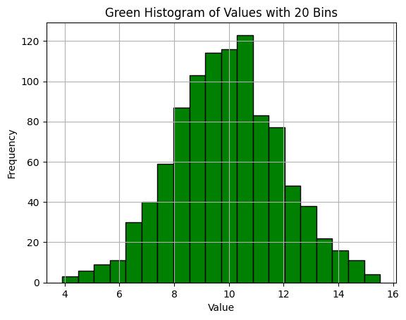
This code changes the color of the histogram to green and adds a grid for easier visibility. You can choose other colors and styles as per your preferences.


Ryusei Kakujo


Weave the future of cities through data
Transportation modeling/ Urban planning/ Machine learning/ Computer science/ GIS