

What is EDA
EDA stands for Explanatory Data Analysis, which is the process of understanding the characteristics, structure, and patterns of data by visualizing data and calculating statistics. Performing EDA well, properly understanding the data, and formulating hypotheses are essential to building a highly accurate machine learning model. It is often said that most of the time spent developing machine learning models is spent on EDA, data preprocessing, and feature engineering.
EDA involves analyzing the following
- How much data?
- What are the statistics (mean, variance, etc.)?
- What is the distribution?
- Are there missing values?
- Are there outliers?
- Are the data correlated?
- Categorical or numerical variables?
- Categorical variables
- What is the cardinality (number of unique labels)?
- Are labels ordered or ranked?
- Are rare labels included?
- Numerical variables
- Is there a time series of data, such as date, year, time, etc.?
- Are the values discrete or continuous?
- Categorical variables
In this article, I will perform a simple EDA using the Kaggle dataset.
Dataset
In this article, I will use the Kaggle House Prices competition dataset This competition is to predict the price (SalePrice) of each house in Ames, Iowa.
Download the following file:
train.csv
Import the required libraries.
import pandas as pd
import numpy as np
import matplotlib.pyplot as plt
import seaborn as sns
import scipy.stats as stats
Load the dataset and check the data.
df = pd.read_csv('train.csv')
pd.set_option('display.max_rows', None)

display(df.head())
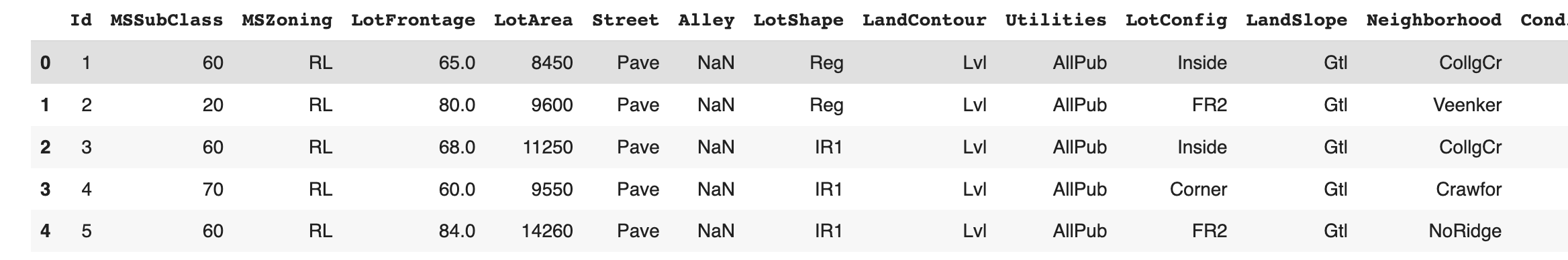
Drop column Id as it is not needed.
df.drop('Id', axis=1, inplace=True)
df.shape
(1460, 80)
This dataset consists of 1,460 samples and 80 columns. The 80 columns also contain the objective variable SalePrice and 79 explanatory variables.
Distribution of objective variable
First, we check the distribution of the objective variable.
df['SalePrice'].hist(bins=50, density=True)
plt.ylabel('Number of houses')
plt.xlabel('SalePrice')
plt.show()
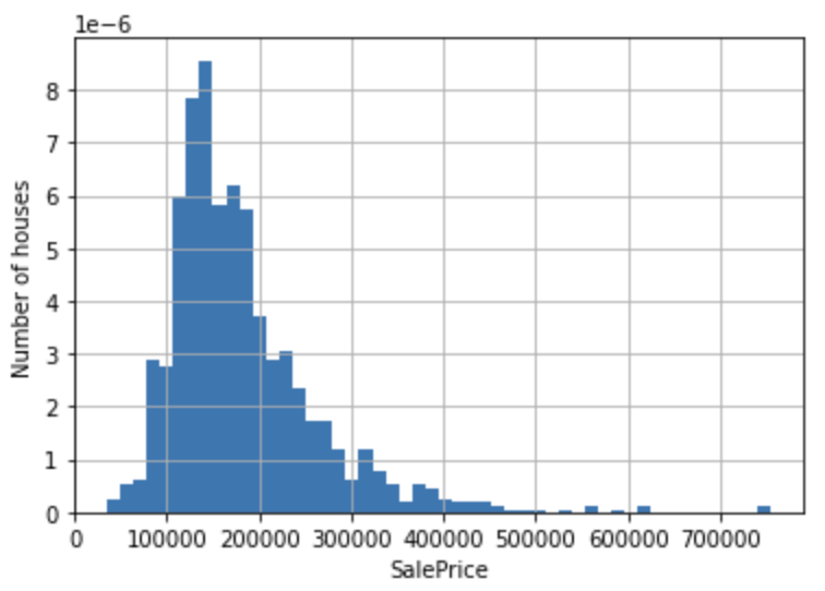
We see that the distribution of the objective variable SalePrice is skewed to the right. We improve this distortion by taking the log.
np.log(df['SalePrice']).hist(bins=50, density=True)
plt.ylabel('Number of houses')
plt.xlabel('Log of SalePrice')
plt.show()
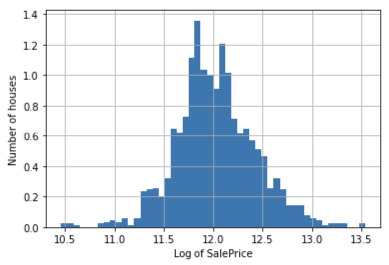
The distribution more closely resembles a normal distribution.
Data types of explanatory variables
Let's identify categorical and numeric variables.
First, identify categorical variables.
cat_vars = [var for var in df.columns if df[var].dtype == 'O']

# MSSubClass is also categorical by definition, despite its numeric values
# so add MSSubClass to the list of categorical variables
cat_vars = cat_vars + ['MSSubClass']

print('number of categorical variables:', len(cat_vars))
number of categorical variables: 44
Cast the columns contained in cat_vars to categorical data.
df[cat_vars] = df[cat_vars].astype('O')
Next, identify the numeric variables.
num_vars = [
    var for var in df.columns if var not in cat_vars and var != 'SalePrice'
]

print('number of categorical variables:', len(num_vars))
number of numerical variables: 35
Missing values
Check which variables in the dataset contain missing values.
vars_with_na = [var for var in df.columns if data[var].isnull().sum() > 0]

df[vars_with_na].isnull().mean().sort_values(
    ascending=False).plot.bar(figsize=(10, 4))
plt.ylabel('% of missing data')
plt.axhline(y=0.80, color='r', linestyle='-')

plt.show()
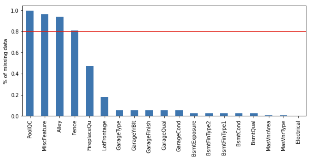
The following columns show missing percentages exceeding 80%.
- PoolQC
- MiscFeature
- Alley
- Fence
Numerical variable
Time series values
A dataset may contain time series data such as year, month, day, and time. In this case, data related to the year is included.
year_vars = [var for var in num_vars if 'Yr' in var or 'Year' in var]
print(year_vars)
['YearBuilt', 'YearRemodAdd', 'GarageYrBlt', 'YrSold']
Visualize the relationship between SalePrice and YrSold.
df.groupby('YrSold')['SalePrice'].median().plot()
plt.ylabel('Median House Price')
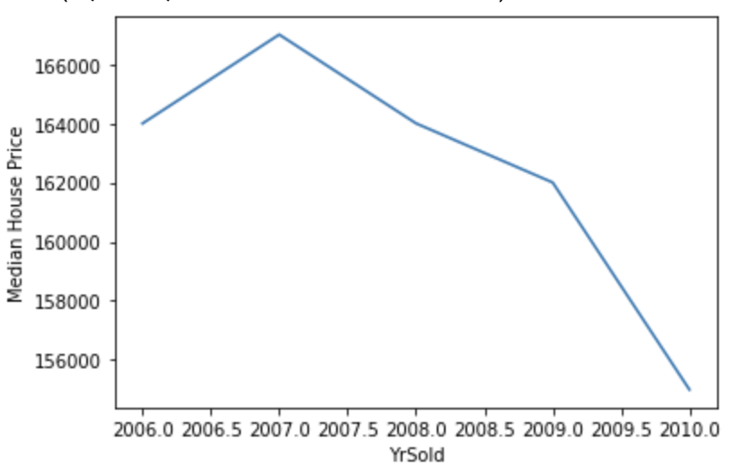
The sale price of homes has been declining year after year.
Discrete values
Check the discrete value, which has a finite number of possible values.
discrete_vars = [var for var in num_vars if len(
    df[var].unique()) < 20 and var not in year_vars]


for var in discrete_vars:
    sns.catplot(x=var, y='SalePrice', data=df, kind="box", height=4, aspect=1.5)
    sns.stripplot(x=var, y='SalePrice', data=df, jitter=0.1, alpha=0.3, color='k')
    plt.show()
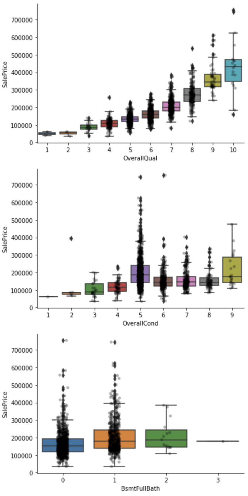
The sale price for OverallQual, OverallCond, and BsmtFullBath in the above capture seems to tend to increase as the value increases.
Continuous Values
Check the distribution of continuous values.
cont_vars = [
    var for var in num_vars if var not in discrete_vars + year_vars]
df[cont_vars].hist(bins=30, figsize=(15,15))
plt.show()
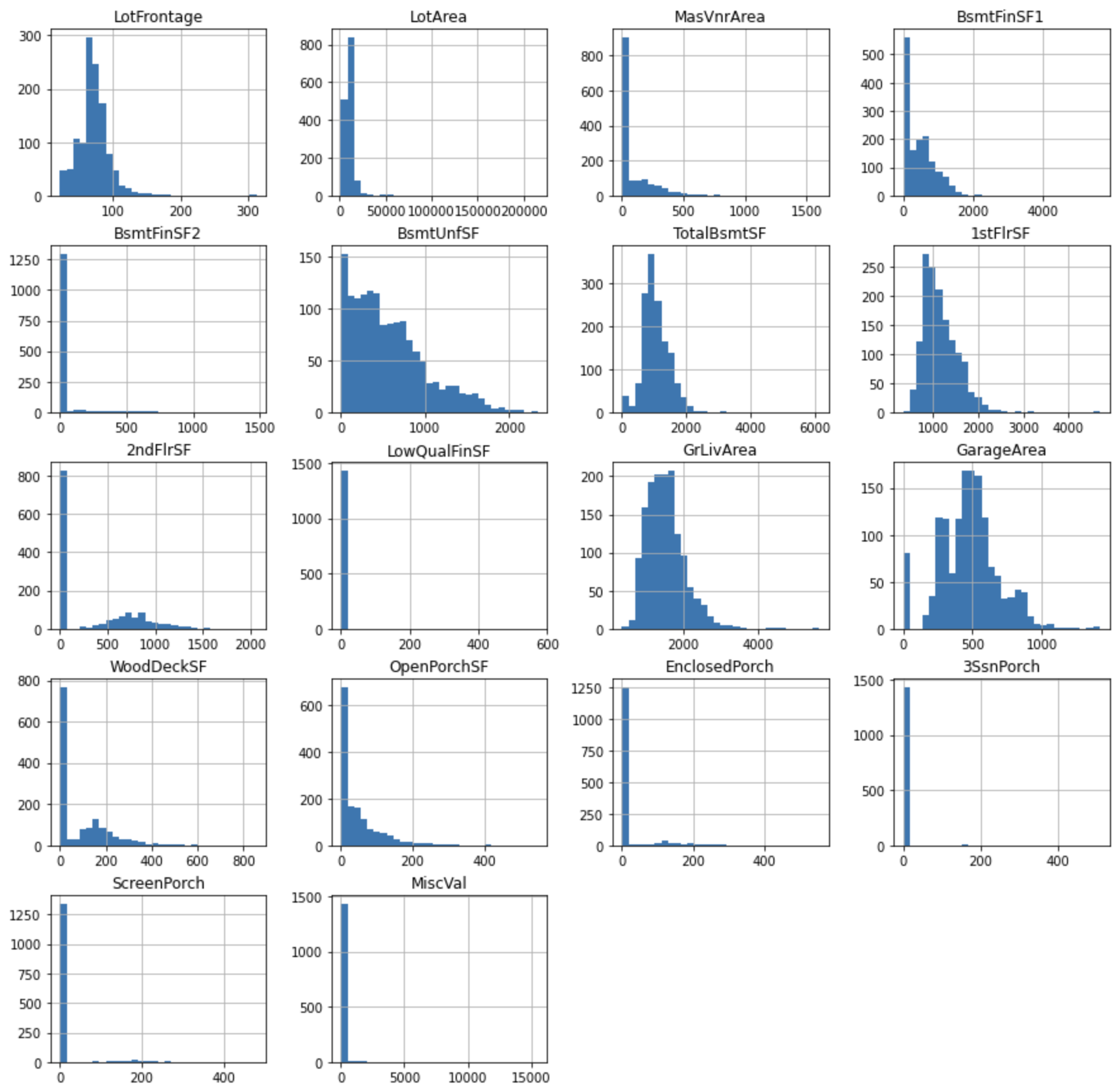
You can see that the variables are not normally distributed. Transforming variables so as to improve the distortion of the distribution may improve the performance of the model.
In this case, apply Yeo-Johnson transformation to variables such as LotFrontage, LotArea, and apply binary transformation to variables with extreme skewness such as 3SsnPorch, ScreenPorch.
Store extremely skewed variables in skewed.
skewed = [
    'BsmtFinSF2', 'LowQualFinSF', 'EnclosedPorch',
    '3SsnPorch', 'ScreenPorch', 'MiscVal'
]

cont_vars = [
    'LotFrontage',
    'LotArea',
    'MasVnrArea',
    'BsmtFinSF1',
    'BsmtUnfSF',
    'TotalBsmtSF',
    '1stFlrSF',
    '2ndFlrSF',
    'GrLivArea',
    'GarageArea',
    'WoodDeckSF',
    'OpenPorchSF',
]
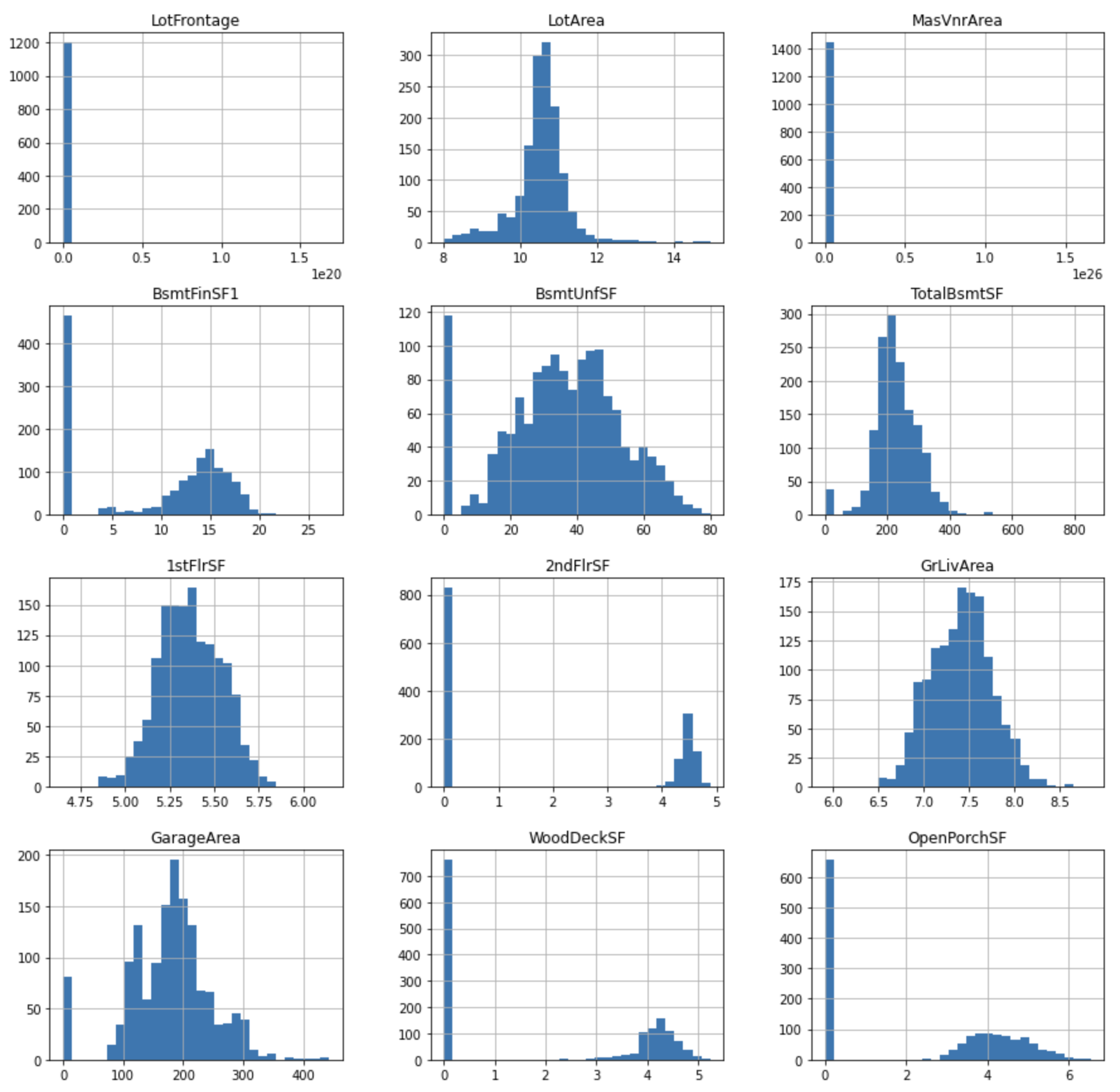
Yeo-Johnson transformation
Applies the Yeo-Johnson transformation.
tmp = df.copy()

for var in cont_vars:
    tmp[var], param = stats.yeojohnson(df[var])

tmp[cont_vars].hist(bins=30, figsize=(15,15))
plt.show()
Visualize the relationship with SalePrice.
for var in cont_vars:
    plt.figure(figsize=(12,4))
    plt.subplot(1, 2, 1)
    plt.scatter(df[var], np.log(df['SalePrice']))
    plt.ylabel('SalePrice')
    plt.xlabel('Original ' + var)
    plt.subplot(1, 2, 2)
    plt.scatter(tmp[var], np.log(tmp['SalePrice']))
    plt.ylabel('SalePrice')
    plt.xlabel('Transformed ' + var)
    plt.show()
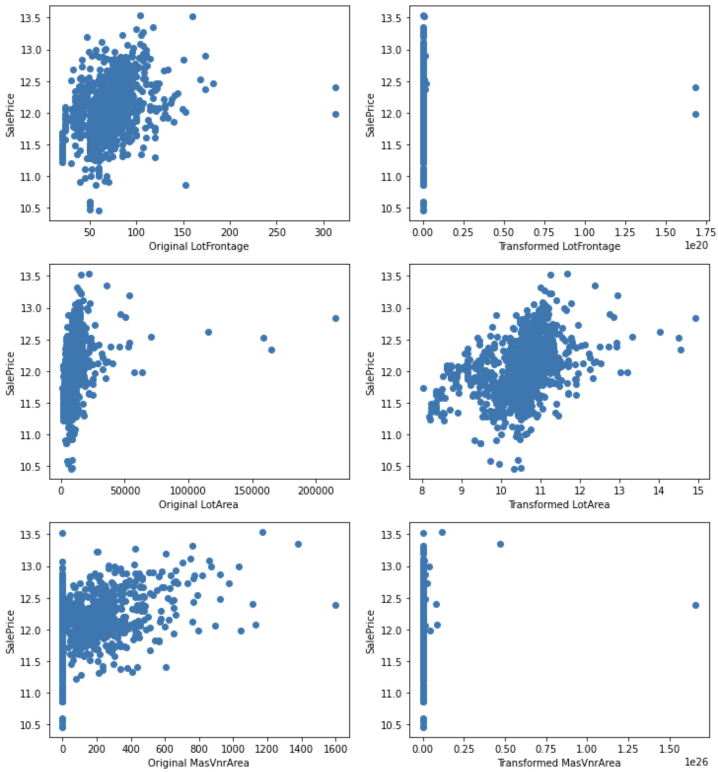
For LotArea, the conversion improves the relationship with SalePrice.
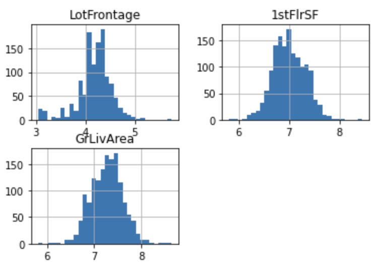
Most variables contain 0, so logarithmic transformation cannot be applied, but it can be applied for LotFrontage, 1stFlrSF GrLivArea. Perform logarithmic transformations on these variables and see if the relationship with SalePrice improves.
Logarithmic transformation
tmp = df.copy()

for var in ["LotFrontage", "1stFlrSF", "GrLivArea"]:
    tmp[var] = np.log(df[var])

tmp[["LotFrontage", "1stFlrSF", "GrLivArea"]].hist(bins=30)
plt.show()
for var in ["LotFrontage", "1stFlrSF", "GrLivArea"]:
    plt.figure(figsize=(12,4))
    plt.subplot(1, 2, 1)
    plt.scatter(df[var], np.log(df['SalePrice']))
    plt.ylabel('SalePrice')
    plt.xlabel('Original ' + var)

    plt.subplot(1, 2, 2)
    plt.scatter(tmp[var], np.log(tmp['SalePrice']))
    plt.ylabel('SalePrice')
    plt.xlabel('Transformed ' + var)

    plt.show()
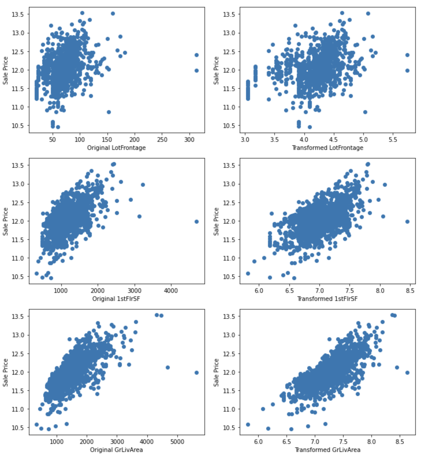
The relationship with SalePrice appears to be improved.
Binary transformations
Performs a binary transformation on extremely skewed variables.
for var in skewed:
    tmp = df.copy()
    tmp[var] = np.where(df[var]==0, 0, 1)
    tmp = tmp.groupby(var)['SalePrice'].agg(['mean', 'std'])
    tmp.plot(kind="barh", y="mean", legend=False,
             xerr="std", title="Sale Price", color='green')
    plt.show()
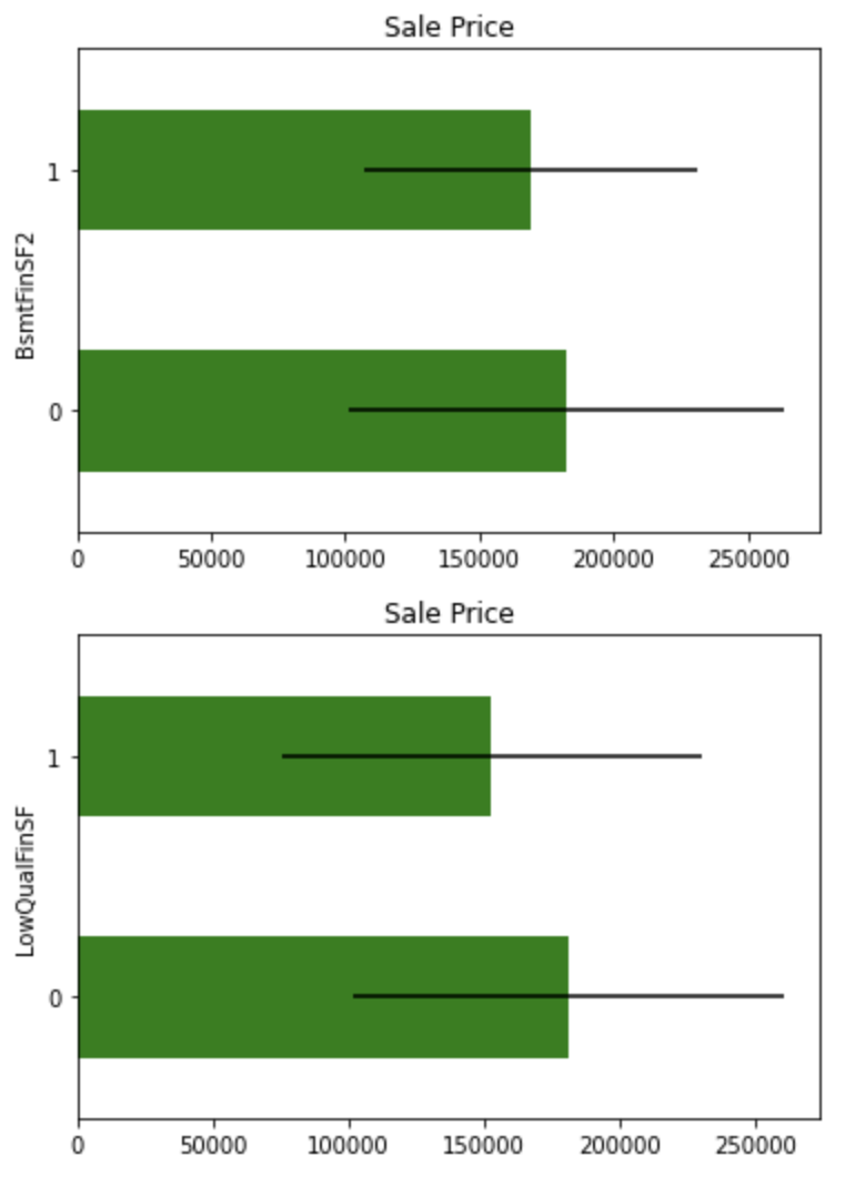
Although these variables differ slightly in mean values, they do not appear to be important explanatory variables because of the overlap in confidence intervals.
Categorical variables
Cardinality
Check the number of unique categories.
df[cat_vars].nunique().sort_values(ascending=False).plot.bar(figsize=(12,5))
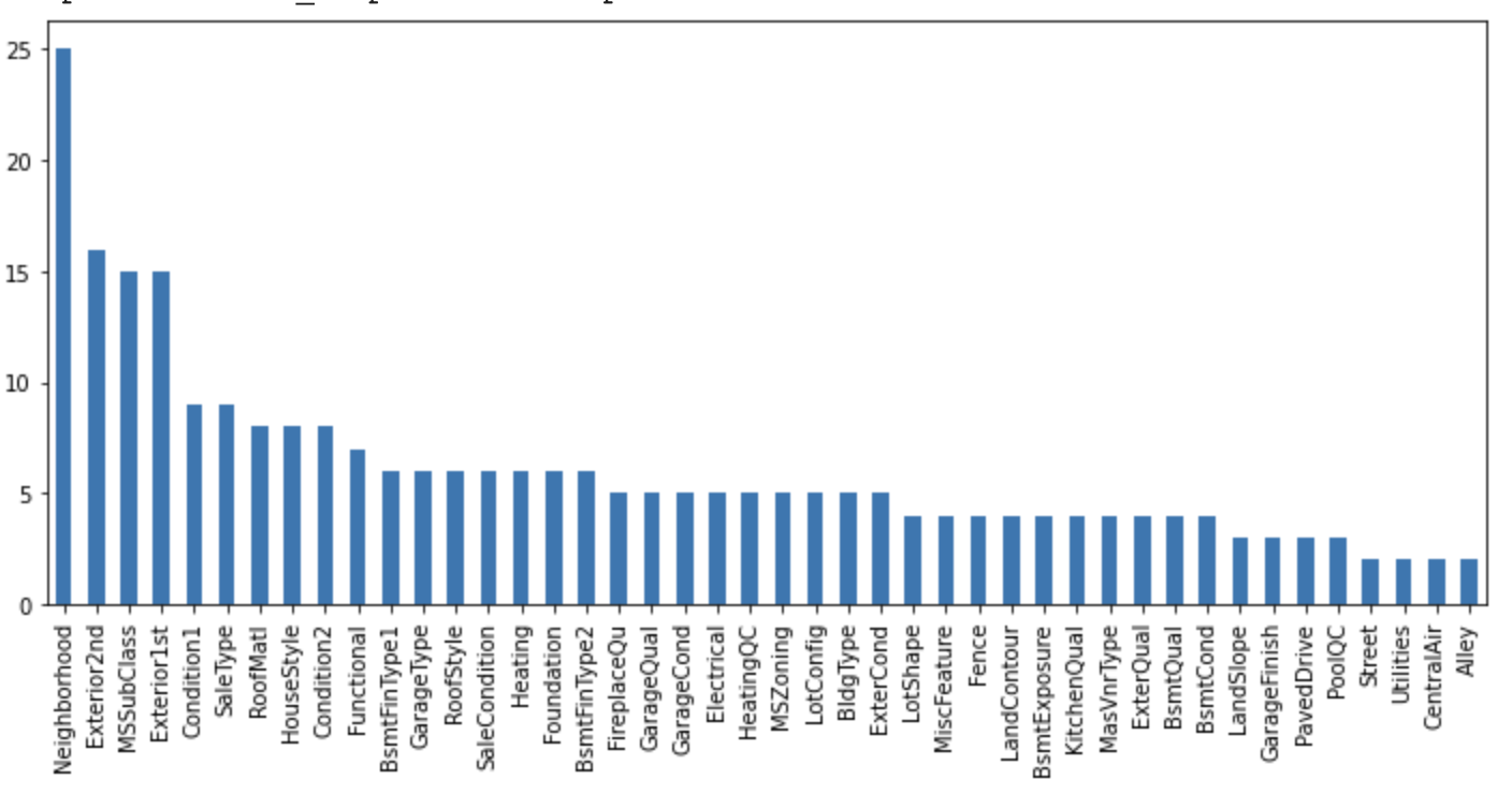
The categorical variables in this dataset indicate low cardinality.
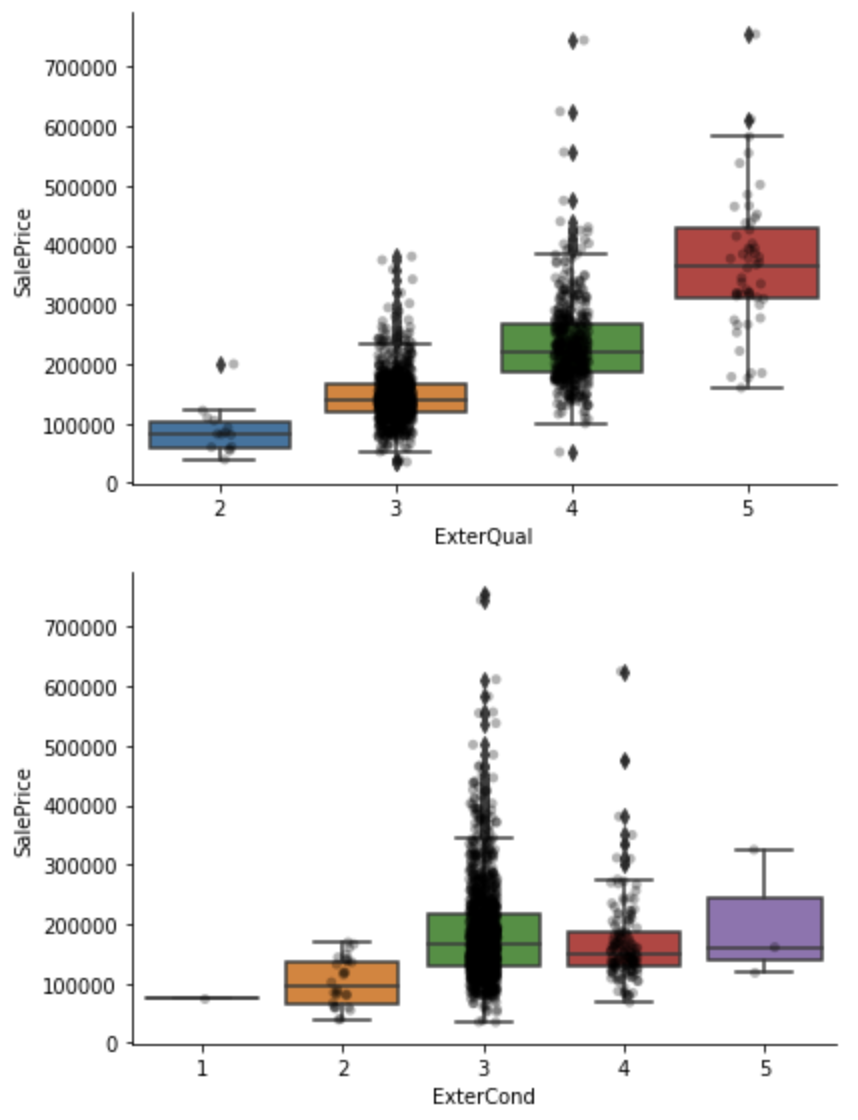
Quality labels
Category variables in a dataset may represent qualities, in which case they are replaced by numerical values.
This time, the dataset contains category variables that increase in quality from "Po" to "Ex" as shown below. Map these to numerical values.
- Ex: Excellent
- Gd: Good
- TA: Average/Typical
- Fa: Fair
- Po: Poor
qual_mappings = {'Po': 1, 'Fa': 2, 'TA': 3, 'Gd': 4, 'Ex': 5, 'Missing': 0, 'NA': 0}

qual_vars = ['ExterQual', 'ExterCond', 'BsmtQual', 'BsmtCond',
             'HeatingQC', 'KitchenQual', 'FireplaceQu',
             'GarageQual', 'GarageCond',
            ]

for var in qual_vars:
    df[var] = df[var].map(qual_mappings)

exposure_mappings = {'No': 1, 'Mn': 2, 'Av': 3, 'Gd': 4, 'Missing': 0, 'NA': 0}

var = 'BsmtExposure'

df[var] = df[var].map(exposure_mappings)

finish_mappings = {'Missing': 0, 'NA': 0, 'Unf': 1, 'LwQ': 2, 'Rec': 3, 'BLQ': 4, 'ALQ': 5, 'GLQ': 6}

finish_vars = ['BsmtFinType1', 'BsmtFinType2']

for var in finish_vars:
    df[var] = df[var].map(finish_mappings)

garage_mappings = {'Missing': 0, 'NA': 0, 'Unf': 1, 'RFn': 2, 'Fin': 3}

var = 'GarageFinish'

df[var] = df[var].map(garage_mappings)

fence_mappings = {'Missing': 0, 'NA': 0, 'MnWw': 1, 'GdWo': 2, 'MnPrv': 3, 'GdPrv': 4}

var = 'Fence'

df[var] = df[var].map(fence_mappings)

qual_vars  = qual_vars + finish_vars + ['BsmtExposure','GarageFinish','Fence']

for var in qual_vars:
    sns.catplot(x=var, y='SalePrice', data=df, kind="box", height=4, aspect=1.5)
    sns.stripplot(x=var, y='SalePrice', data=df, jitter=0.1, alpha=0.3, color='k')
    plt.show()
Rare labels
Some categorical variables may have labels that are present less than 1% of the time. Labels that are underrepresented in the dataset tend to cause overfitting of the machine learning model, so they should be removed. The following code extracts labels that occur less than 1% of the time.
cat_others = [
    var for var in cat_vars if var not in qual_vars
]

def analyse_rare_labels(df_, var, rare_perc):
    df = df_.copy()
    tmp = df.groupby(var)['SalePrice'].count() / len(df)
    return tmp[tmp < rare_perc]

for var in cat_others:
    print(analyse_rare_labels(df, var, 0.01))
    print()
MSZoning
C (all)    0.006849
Name: SalePrice, dtype: float64

Street
Grvl    0.00411
Name: SalePrice, dtype: float64

.
.
.
Conclusion
EDA is just one example, there are many more things to analyze, and a good EDA and deep understanding of the data is required of data scientists.
References


Ryusei Kakujo


Weave the future of cities through data
Transportation modeling/ Urban planning/ Machine learning/ Computer science/ GIS